Color Inspiration | Mari Clarke

Hey friends, it’s creative team member Mari here today with a quick tutorial about color inspiration. How do you choose the color scheme for a project? There are so many ways to tackle this. You can:
- use your photo to guide you
- use your products to guide you
- use a mood board
- use colors you love with a black and white photo or to complement the colors in your photo
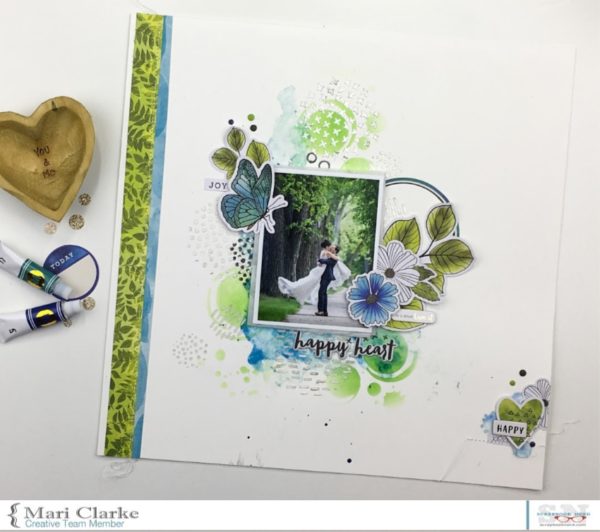
Today I am sharing a layout that I created using a color scheme that was inspired by my photo.

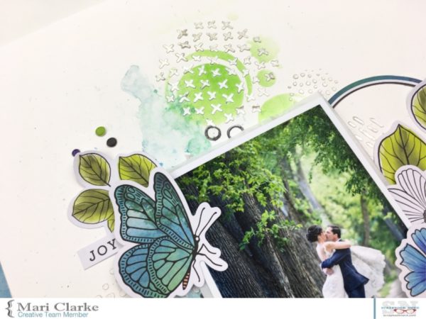
You can see this photo has lots of greens and blues. I wanted to use the photo in color rather than black and white, but needed the perfect products for the color scheme to complement this gorgeous photo.

The Field Notes collection from Vicki Boutin and American Crafts is just the perfect match for my project…the collection has all of the perfect colors and bits and pieces to create a design that does justice to this photo.

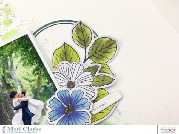
This close up shot of the die cuts shows the lovely tones of the color palette; they are so perfect for what I was going for.

You can see that all of the elements of the collection have the best colors for what I needed. The art crayons, water colors and die cuts are so perfect! The tone of greens is so vibrant; I just love how it matches the green in the photo.
I hope this inspired you to find some new ways to think about color scheme with your next project!
Have an amazing day, friends!
xxMari

← Older Post Newer Post →

1ezuqw
ieh0oc
144xns
d7dtdf